Here and There Travel — Travel Brand Identity
Travel agency identity — flight-path wordmark, gold on black system, campaign and print collateral.
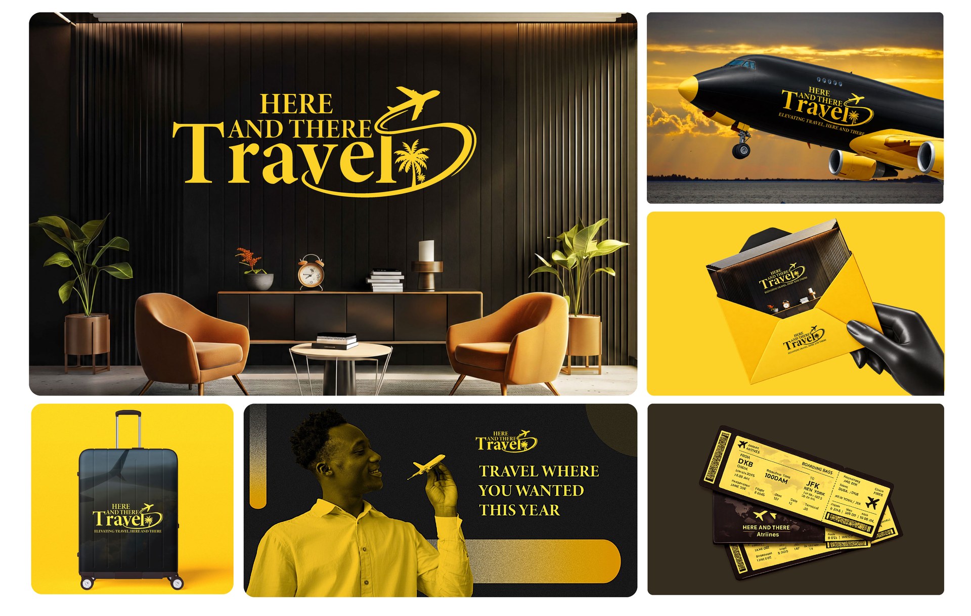
Here and There Travel books long-haul trips for people who would rather talk to a person than a booking engine. The identity had to feel like a service, not a marketplace.
The wordmark leans on a warm serif with the word Travel set in script, and a single flight path loops out of the final letter, circling a palm before it lifts off. One continuous line does the work of an icon, a swash and a destination all at once.
Gold on near-black gives the brand its lounge feel. A duotone photography treatment keeps campaign work on-brand without a shoot budget, and the rollout covers the office wall, ticket wallets, luggage, envelopes and social campaign layouts.
Deliverables
- Primary logo and flight-path mark
- Gold and black colour system
- Duotone photography treatment
- Ticket wallets and boarding collateral
- Office wall branding and signage
- Campaign and social layouts
Need an identity that earns attention in your market?
Digifies builds brand identities, design systems and websites for founders and teams in the US, UK, Australia, Canada and Europe.
Start a project