Accelety — Performance Driven Digital Marketing
Performance marketing agency identity — arrow monogram, two-tone green system, stationery and packaging.
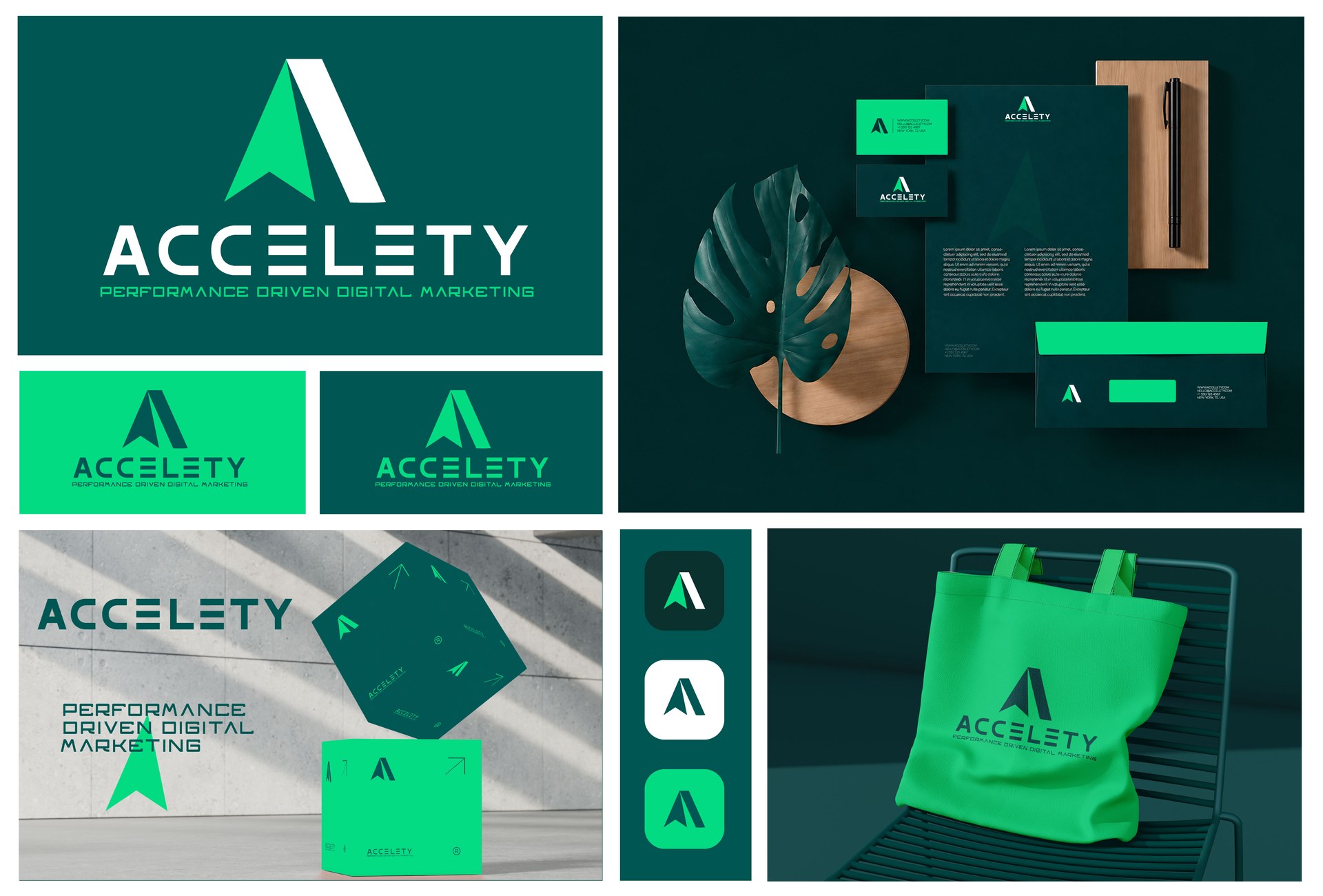
Accelety sells one thing: measurable acceleration. The brief was to make that legible in a category where most agencies look like software companies — gradients, abstract shapes and a promise you cannot picture.
The mark is a literal answer. An upward arrow cuts through the counter of the “A”, so the letter and the direction become the same shape. Stencil-cut gaps in the wordmark keep it technical rather than corporate, and a two-tone green system — deep forest for ground, bright signal green for momentum — carries all the contrast without a second accent colour.
The identity runs across stationery, packaging, app icons and merchandise. The arrow repeats as a pattern at small scale, so an envelope or a tote still reads as Accelety before the name is visible.
Deliverables
- Primary logo, stacked lockup and arrow monogram
- Colour palette and stencil typography system
- Stationery — letterhead, business cards and envelopes
- Packaging and box design
- App icon set and branded merchandise
- Brand pattern and usage guidelines
Need an identity that earns attention in your market?
Digifies builds brand identities, design systems and websites for founders and teams in the US, UK, Australia, Canada and Europe.
Start a project