LOCAL — Neighbourhood Coffee Brand Identity
Neighbourhood coffee brand identity — map-pin wordmark, line illustration, packaging and menu design.
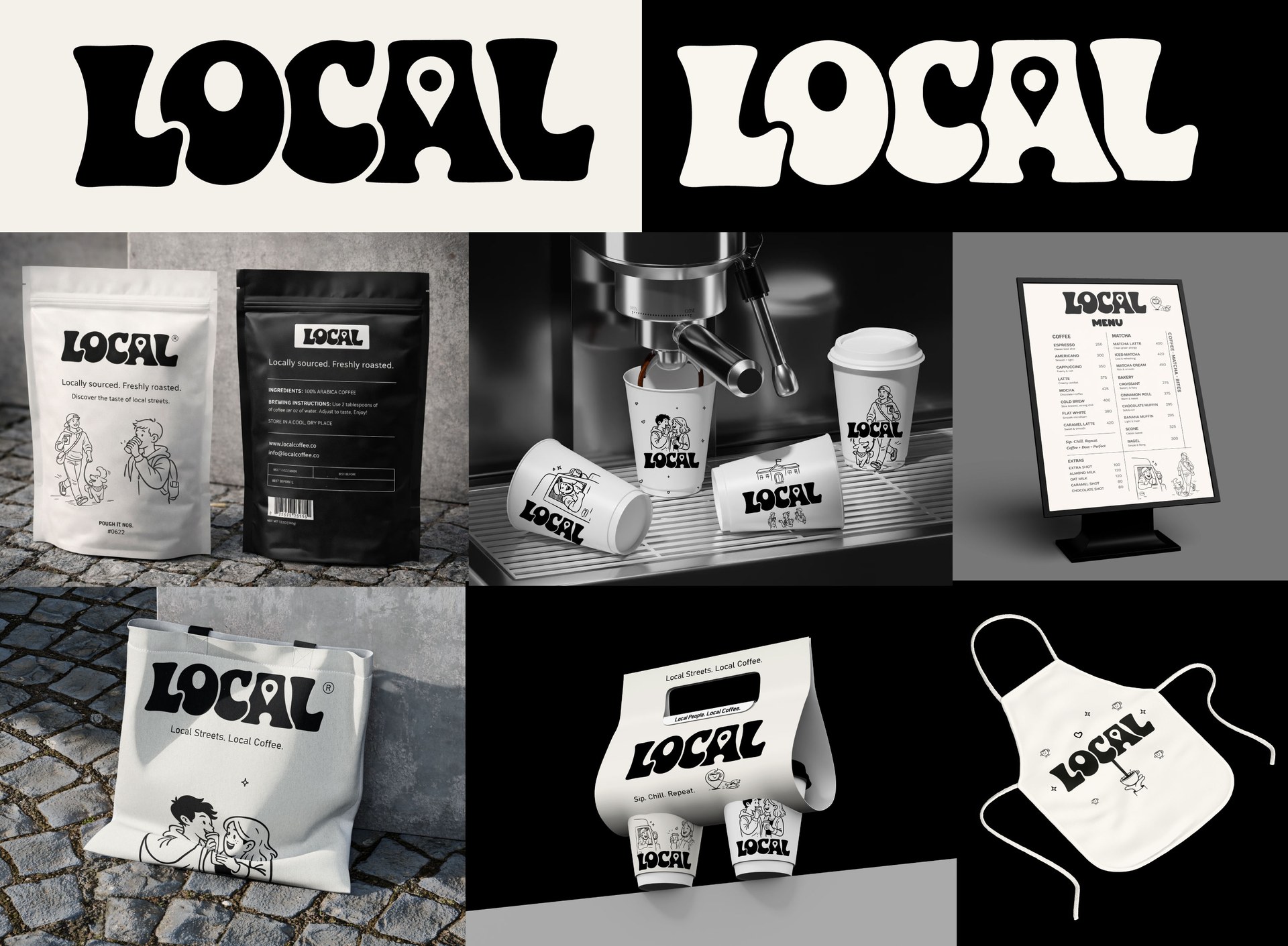
LOCAL is a neighbourhood coffee shop whose whole pitch is the street it sits on. The identity had to feel like the corner it came from, not like a chain that could be dropped anywhere.
The wordmark is a heavy seventies-style script with one quiet trick: the counter of the O is cut into a map pin, and the A carries the same notch. It is a location marker hiding inside the name, and it is the only piece of cleverness in the system.
Everything else is warmth. A cast of hand-drawn regulars — a courier, a couple, a dog walker — runs across cups, bean bags, totes and aprons, printed in black on off-white so the illustration does the talking and production stays cheap.
Deliverables
- Primary wordmark and map-pin mark
- Monochrome colour system
- Character illustration set
- Bean bag, cup and carrier packaging
- Menu board and in-store collateral
- Totes and aprons
Need an identity that earns attention in your market?
Digifies builds brand identities, design systems and websites for founders and teams in the US, UK, Australia, Canada and Europe.
Start a project